
The Micro-Ergonomics of Financial Dashboards: Why Data Density Isn't the Enemy of Usability

In the design world, there is a recurring temptation to take the serene, airy aesthetics of consumer apps—vast negative space, generous line-heights, oversized cards, and pastel gradients—and paste them onto enterprise software.
When designers do this to financial dashboards, the result is almost universally rejected by the people who actually use the tool eight hours a day.
To an institutional trader, a risk analyst, or a corporate treasurer managing $50M in liquidity, excess whitespace is not elegance. It is cognitive friction.
Every unnecessary pixel of padding forces another mouse scroll. Every page transition breaks the operator's mental buffer. When millions of dollars are fluctuating per minute, the goal of an interface is not to look like an Apple marketing slide—it is to provide maximum situational awareness per square inch of glass.
Here are the four micro-ergonomic principles I use when architecting high-density financial systems.
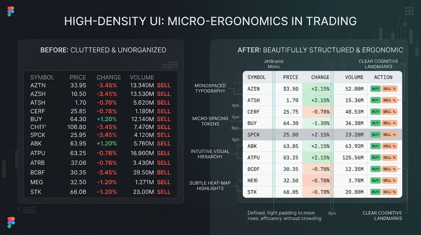
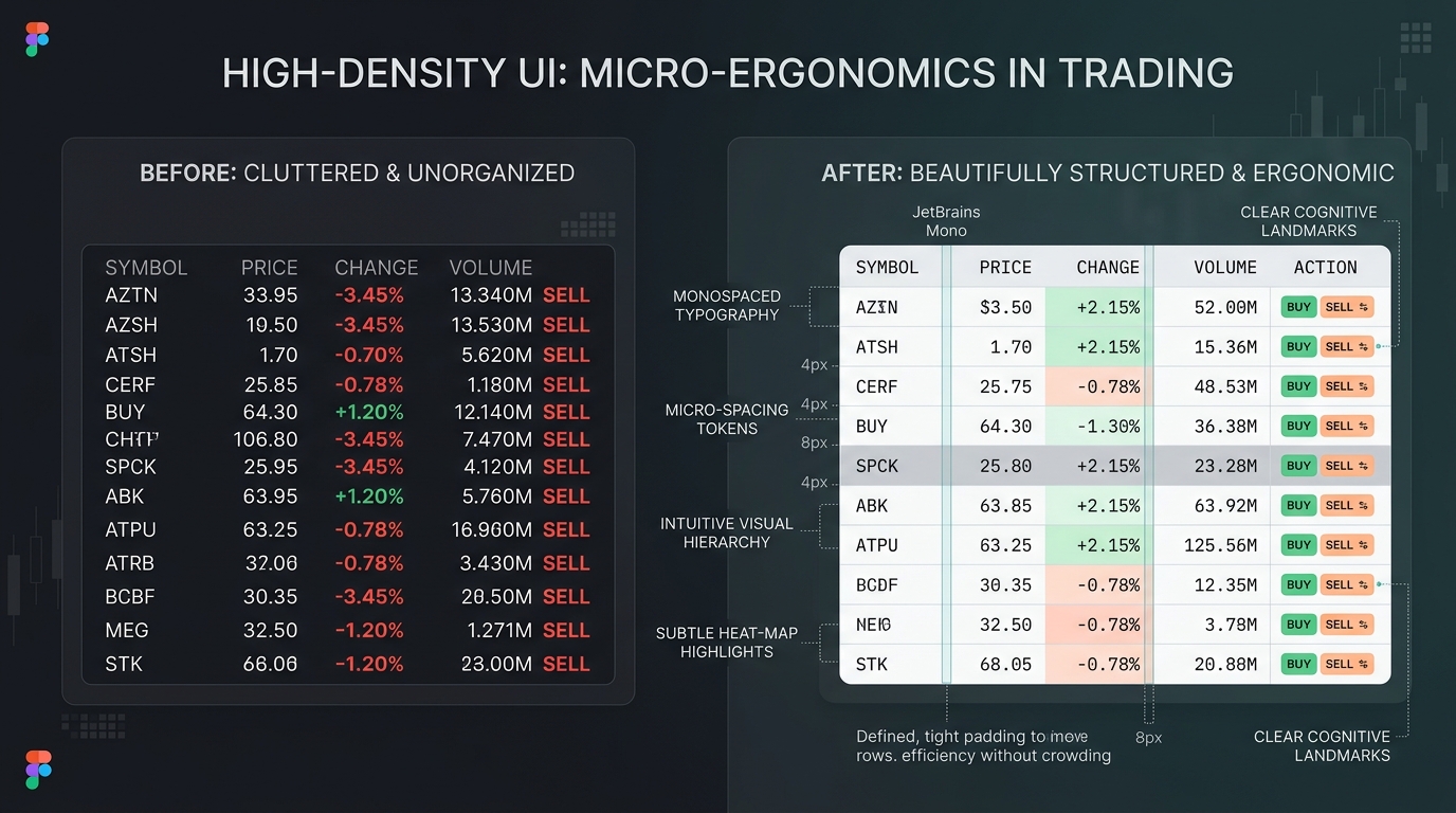
1. Monospaced Tabular Lining (font-variant-numeric: tabular-nums)
The single most common typographic sin in financial UI design is using standard proportional numerals in data tables.
In proportional fonts, the number "1" is significantly narrower than the number "8". When live market tickers update, numbers shift horizontally back and forth like a shivering seismograph. This forces the human eye to continuously re-anchor its focal point.
/* The essential CSS for every financial interface */
.financial-numeral {
  font-family: var(--font-sans);
  font-variant-numeric: tabular-nums lining-nums;
  letter-spacing: -0.01em;
}
By enforcing tabular lining figures, every digit from 0 to 9 occupies the exact same horizontal width. Thousands separators line up in a clean vertical axis, allowing an operator to scan down a ledger of 50 rows in seconds and intuitively detect magnitude differences.
2. Micro-Spacing Tokens: The 4px Spatial Matrix
Consumer interfaces thrive on 16px to 24px cell padding. In high-density financial consoles, this padding consumes up to 60% of the viewport with dead space.
Instead, we engineer a compact token matrix:
- Cell Padding: 6px vertical, 8px horizontal.
- Line Height: Strict 1.25 to 1.3 relative ratio.
- Row Heights: 32px standard row, 28px ultra-dense mode for multi-screen trading terminals.
The key to preventing visual claustrophobia is not generous margins—it is flawless typographic contrast and subtle border delimiters (such as rgba(0, 0, 0, 0.04)).
3. Subtle Heat-Map Highlights over Loud Badges
Novice designers often draw heavy, bright pill badges around every status change: bright green backgrounds with white text for "BUY", screaming red boxes for "SELL".
When a grid contains 400 active rows, the interface looks like a neon holiday tree, causing rapid sensory exhaustion.
High-density ergonomics replaces loud badges with subtle tinted background fills:
- Neutralized text color with a high-contrast monospaced symbol.
- Backgrounds at 8% to 12% opacity (
rgba(16, 185, 129, 0.1)). - Left-edge 2px accent bars that provide instant peripheral recognition without overwhelming the foveal field of vision.
4. Progressive Disclosure with Keyboard Muscle Memory
The true secret to clean density is progressive disclosure triggered by keyboard shortcuts rather than cluttered button toolbars:
- Inline Quick Actions: Instead of displaying five action buttons on every single row, keep rows clean and reveal contextual hotkeys on row hover or row focus (
Spaceto expand breakdown,Rto rebalance,Cmd + Enterto execute). - Split-Screen Flyout Drawers: Never navigate an operator away from the primary data ledger to inspect an individual transaction. Slide a zero-latency drawer from the right edge, keeping the primary ledger anchored in peripheral view.
Conclusion: Empathy Means Respecting the Operator's Craft
Good product design is never about imposing our aesthetic preferences onto specialized domains. It is about understanding the cognitive demands of the human sitting behind the glass.
When we build with micro-ergonomic density, we give operators the superpower to see the whole picture at once, act with confidence, and never miss a beat.