
Prism: Multi-Brand Unified Enterprise Design System
Architecting a unified, WCAG AAA compliant multi-brand design system spanning 4 web portals and 2 mobile native applications.
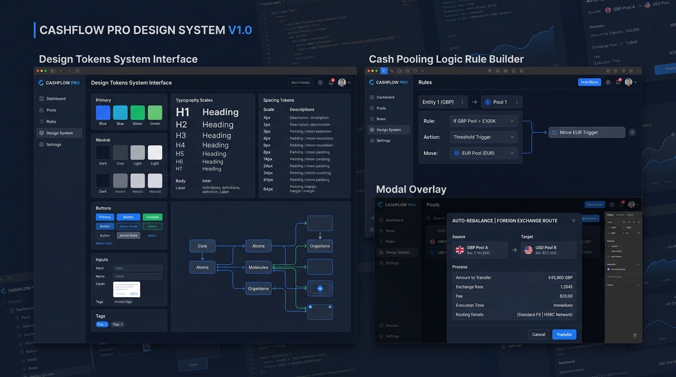
Prism three-tier design token architecture and WCAG AAA accessible component documentation.
Challenge & Enterprise Scale
OmniHealth Cloud operates a portfolio of mission-critical healthcare software: patient-facing appointment portals, hospital EHR systems, and mobile nurse telemetry tools. Over 6 years of rapid acquisitions, the engineering team had accumulated 5 disparate codebases with zero shared UI foundation.
An initial audit revealed 34 conflicting modal implementations, 18 distinct primary button states, and numerous severe WCAG color contrast violations that posed severe regulatory risks for healthcare compliance.
The Strategic Systems Approach
Rather than merely creating another Figma UI kit, we engineered an end-to-end design systems infrastructure called Prism:
1. Three-Tier Token Architecture
We structured design tokens into three deterministic tiers:
- Global Tokens: Raw values (e.g.,
blue-500,font-size-16). - Semantic Tokens: Contextual meaning (e.g.,
surface.brand.default,feedback.error.subtle). - Component-Specific Tokens: Rigid scoped variables for high-frequency patterns (e.g.,
button.primary.hover-bg).
2. Automated Token Pipeline (Figma Variables -> GitHub)
Engineered automated GitHub Actions workflows using Style Dictionary to transform Figma Variables directly into JSON tokens, CSS Custom Properties, and TypeScript types consumed by React and React Native components.
3. Accessible Component Governance
Authored comprehensive Storybook documentation, keyboard navigation specs, and screen-reader accessibility rules for 120+ core interactive components.
Measurable Results & Organizational Impact
- 60% Acceleration in Feature Delivery: Squad sprint cycles were shortened from 3 weeks to 8 days for new dashboard modules.
- 100% WCAG AAA Healthcare Compliance: Passed strict hospital procurement and federal accessibility compliance audits without a single violation flag.
- Over 400 Engineering Hours Saved Quarterly: Eliminated repetitive component rewrites and visual discrepancy debates between designers and frontend teams.